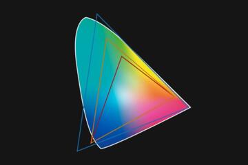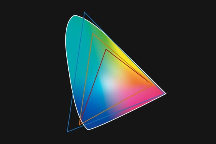
sRGB Vs Display P3
Color spaces describe how a device maps numeric color values to visible colors. sRGB is the long-standing default for web images and most consumer workflows, while Display P3 is a wider-gamut color space used by many modern displays and some Apple platforms. When an image is tagged with one color space but interpreted as another, the same pixels can look washed out or oversaturated.
In practice, the “tag” matters as much as the numbers. A JPEG exported with an embedded sRGB profile will usually look consistent on typical browsers, even when the screen is capable of more. A Display P3-tagged asset can show more saturated colors on capable displays, but it also depends on the viewer’s color management path.
For a concrete example, a vivid red in a wide-gamut photo may appear deeper on a Display P3-capable screen when the file is tagged and handled correctly. On a device that assumes sRGB, that same red may clip to the nearest representable sRGB value, losing detail in highlights and edges.
One small aside from real workflows: macOS Preview and some image tools show different previews depending on whether “Use ColorSync” is enabled, and that can make debugging feel inconsistent. I’ve seen the same PNG look different between an app preview and a browser tab, which usually traces back to color management settings rather than the file itself.
Where Color Goes Wrong
Most mismatches come from a chain of assumptions: the exporter’s color profile, the file format’s support for profiles, the operating system’s color management, and the app’s rendering pipeline. If any link treats the numbers as if they belong to a different color space, the result shifts.
People often get tripped up by three dependencies: embedded profiles, browser or app support for wide-gamut rendering, and the display’s own calibration. A file can be tagged correctly yet still render oddly if the viewer ignores the embedded profile or applies a generic conversion.
Another common pain point is confusing “wider gamut” with “better.” Display P3 covers more saturated colors than sRGB, but it does not guarantee that every image benefits. If the source content was created in sRGB or was already clipped, switching to Display P3 tagging can expose artifacts rather than improve realism.
Finally, HDR-adjacent workflows complicate expectations. Display P3 is a gamut definition, not an HDR standard. Some devices map wide-gamut SDR content differently from HDR content, and the same file can look different when the system switches modes.
Practical Choices For Exports
Pick A Target For Web
For most web publishing, export in sRGB with an embedded sRGB profile. This matches the default expectations of many browsers, CMS tools, and social platforms that may not honor wide-gamut profiles consistently. If you need a wide-gamut look on capable devices, test a Display P3 export in parallel rather than replacing sRGB everywhere.
A realistic outcome to aim for: on typical sRGB paths, you should see minimal shifts across Chrome, Firefox, and Safari when the file is tagged sRGB. On wide-gamut paths, you may see richer reds and greens, but only when the viewer honors the embedded profile.
Tooling note: in Adobe Photoshop, the “Export As” dialog includes a color profile option, and in Lightroom Classic you can choose output color space during export. In Affinity Photo, the export profile setting is also explicit. If you leave these defaults to guesswork, you’ll get inconsistent results across devices.
Use Display P3 With Tests
Choose Display P3 tagging when your target devices and viewers are known to support it, such as certain modern mobile and desktop environments. The goal is not “more saturation,” but preserving the creative intent of wide-gamut sources. Export a Display P3 version only after confirming that your viewing apps respect the embedded profile.
Testing method: compare the same file in at least two environments—one that is likely to treat content as sRGB and one that supports Display P3. If you have access to a color-managed browser and a second app that shows profile handling, you can detect whether the conversion is happening correctly.
Small aside: I’ve seen differences between Safari and Chrome previews when the same file is opened directly versus served through a local web server, which suggests that the serving headers and the app’s pipeline both matter.
Match File Format Behavior
File format affects how profiles travel. JPEG commonly carries an embedded ICC profile, while PNG can also embed profiles but may be handled differently by apps. Some workflows strip profiles during upload or conversion, which defeats the point of tagging.
Practical step: after exporting, inspect the file’s metadata with a tool that can show embedded ICC profiles. On macOS, ColorSync Utility can help verify what profile is embedded, and on Windows, some imaging tools show profile details. If the profile disappears after upload, you’ll need to adjust the pipeline or accept that the viewer will assume a default.
Realistic outcome: if the profile survives, you should see consistent behavior on color-managed viewers; if it gets stripped, you’ll fall back to whatever default the viewer uses, often sRGB.
Control Conversion In Your Pipeline
When you convert between color spaces, do it once, deliberately, and document the step. Repeated conversions can introduce banding or shift neutrals, especially in gradients. If you start with a wide-gamut source, convert to sRGB for web delivery while keeping a master in the original working space.
For numbers, treat “acceptable change” as a visual threshold rather than a promise. A well-managed conversion typically preserves neutral grays and skin tones, but saturated colors may clip if they exceed the destination gamut. That clipping is not a bug; it’s a limitation of mapping colors outside the target gamut.
Version detail that matters in practice: color management behavior can differ across OS releases and browser versions, so record the environment when you validate exports. A test done on macOS 14 with a specific browser build may not match macOS 15 behavior if the rendering pipeline changes.
Educational Case Examples
Case 1: Product Photos For A Storefront
A small retailer exports product images from a raw workflow. The first upload uses Display P3 tagging, and the store’s product page looks slightly oversaturated on some customer devices. The retailer switches to sRGB exports with embedded profiles and rechecks the same page on multiple devices. The oversaturation largely disappears because the store’s image pipeline and browser rendering align more reliably with sRGB.
What changed: the retailer reduced reliance on wide-gamut handling in the storefront pipeline. The creative intent for most product colors stayed consistent, and only the most saturated swatches showed a small reduction in intensity.
Case 2: Designer Mockups For A Client Review
A designer prepares marketing mockups for a client who reviews on a laptop with a wide-gamut screen. The designer shares a Display P3 PNG and also shares an sRGB JPEG fallback. In the client’s review app, the Display P3 version looks richer, while the sRGB version looks slightly flatter but still accurate. The designer keeps both files and uses the sRGB version for distribution channels that strip profiles.
What changed: the designer treated color space as part of the delivery contract, not just a file setting. The client could choose the version that matched their viewing environment.
Comparison Checklist
| Decision Point | sRGB Export | Display P3 Export | What To Verify |
|---|---|---|---|
| Primary target | Web, mixed devices, uploads | Known wide-gamut viewers | Whether embedded profiles survive |
| Color consistency | Higher across unknown pipelines | Depends on viewer support | Browser/app rendering behavior |
| Saturated colors | May clip earlier | Preserves more gamut range | Clipping in highlights and edges |
| Recommended workflow | Convert once for delivery | Keep masters, export variants | Avoid repeated conversions |
Step-by-step checklist for a reliable decision:
- Export an sRGB version with an embedded sRGB profile for general distribution.
- Export a Display P3 version only if your target viewers are known to support it.
- Open both files in at least two apps and one browser tab served from a local server, not just a direct file open.
- Verify that the embedded profile remains after upload to your CMS or social platform; if it disappears, treat the output as sRGB by default.
- Compare neutrals (grays, skin-tone midtones) and saturated edges; gamut issues show up there first.
Common Mistakes
One frequent mistake is exporting Display P3 content and assuming the viewer will always interpret it correctly. Many platforms either convert to sRGB or ignore embedded profiles, which turns a wide-gamut file into a different look than intended.
Another mistake is mixing color-managed and non-color-managed previews. If an image tool shows a different result than a browser, the discrepancy often comes from whether the tool honors ICC profiles. Debugging becomes harder when you compare screenshots from different devices without noting the viewing app.
People also overcorrect by “boosting saturation” to compensate for perceived dullness. That approach can worsen clipping when the file later converts to sRGB, producing harsh bands in gradients and neon edges.
A practical frustration: some upload pipelines strip metadata profiles, and the only symptom is a subtle shift that looks like “slightly wrong color.” If you cannot verify profile retention, you’ll end up chasing the wrong cause.
FAQ
Does Display P3 Improve Every Photo
Display P3 can preserve more saturated colors when the source and viewing pipeline support wide-gamut rendering. If the original content was already clipped to sRGB or the viewer converts to sRGB, the perceived improvement may be minimal or negative.
Will sRGB Look Correct On Wide-Gamut Screens
Usually yes, because sRGB is the common default and many systems convert sRGB into the display’s wider gamut while preserving the intended mapping. The result depends on whether the viewer honors the embedded sRGB profile.
Do Browsers Always Respect ICC Profiles
No. Browser and app support for embedded ICC profiles varies by platform, version, and rendering path. Testing on the specific browsers used by your audience is the most reliable way to confirm behavior.
Should I Upload Both sRGB And P3
For distribution channels that strip profiles or show inconsistent wide-gamut behavior, uploading an sRGB version is the safer default. A Display P3 variant can help when you control the viewing environment or can verify profile retention.
What Happens When The Profile Is Wrong
When an image is tagged with one color space but interpreted as another, colors shift because the conversion uses the wrong mapping. Saturated colors clip sooner, and neutrals can drift, which often shows up as gray looking tinted.
Author's Insight
Color space handling is a systems problem, not a single setting. The same file can look different depending on whether the viewer honors embedded ICC profiles and how it maps SDR wide-gamut content to the display. A practical approach is to treat sRGB as the delivery baseline and use Display P3 only when you can verify that your pipeline preserves profiles end-to-end. When you test, compare neutrals and saturated edges, and record the app and browser versions because behavior can change between releases.
Key Takeaways
- sRGB tagging tends to produce more consistent results across mixed devices and upload pipelines.
- Display P3 can preserve more saturated colors, but it depends on profile support in the viewer and the platform.
- Verify embedded profiles survive export and upload; profile stripping is a common cause of “mystery” color shifts.
- Export once for delivery, avoid repeated conversions, and test in the apps your audience actually uses.